[Instruction] How To Setup and Use "Grid" Field
April 17, 2026
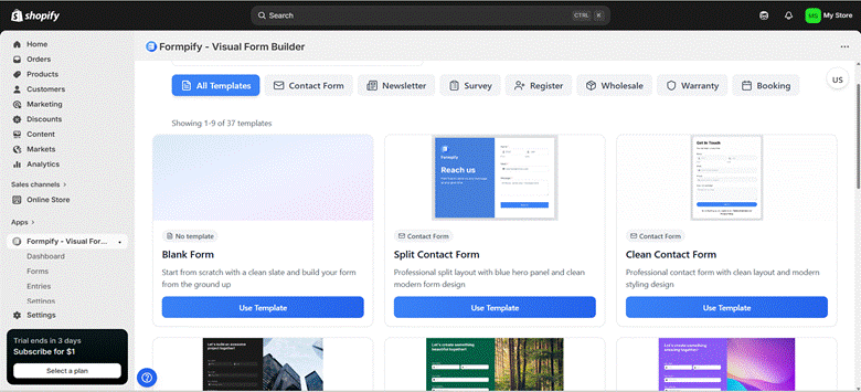
1. Access Form Builder
- From the Shopify Admin dashboard, navigate to Apps -> Formpify-Visual Form Builder.
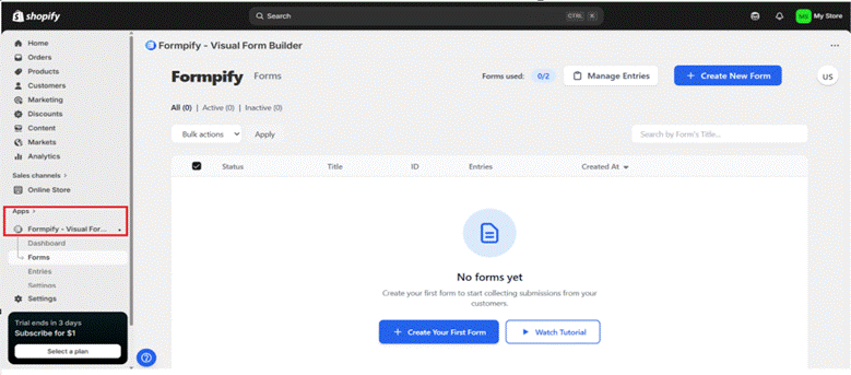
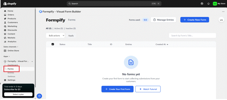
- Click Forms from the left sidebar.
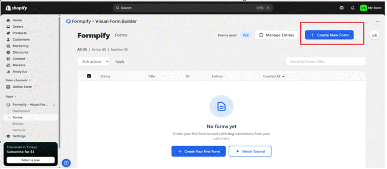
- Click “Create New Form” or select an existing form to edit.
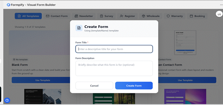
- Choose a template and click Use Template.
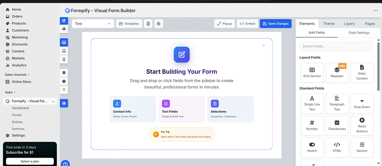
- Enter the Form Title and Form Builder interface.
- You will be directed to the Form Builder screen.
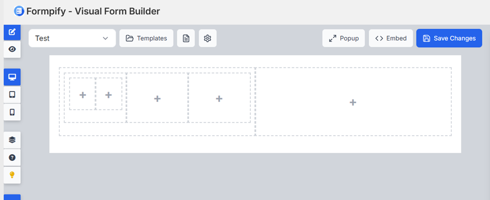
2. Add a Grid Field
- In the right panel, open the Elements tab.

- Click the Grid Section under Layout Fields in the Add Fields panel.
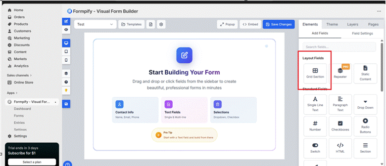
- A Column Count popup will appear.
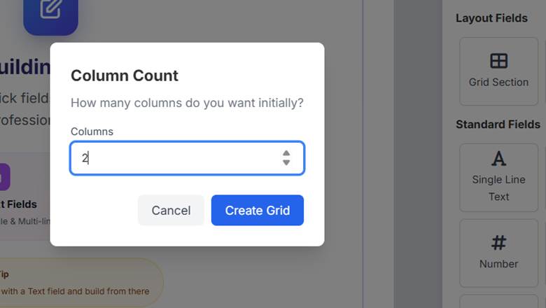
- Enter the number of columns you want (e.g: 2 ), then click Create Grid to insert it into the form.
3. Edit Grid Columns
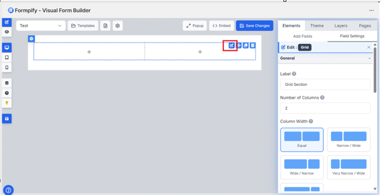
- Click the Edit (pencil) icon on the Grid to open the Grid settings panel.
3.1 General section:
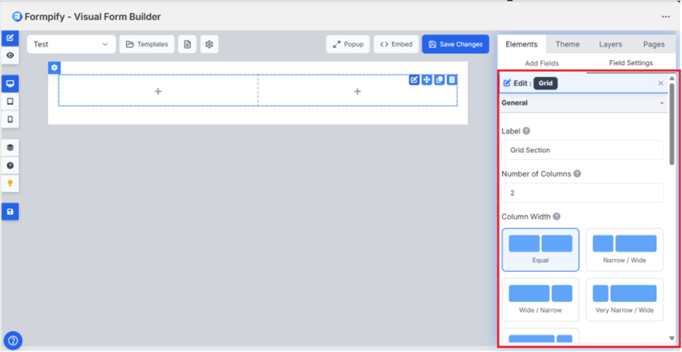
- Label: Sets the name of the Grid section.
- Number of Columns: Defines how many columns the Grid contains. Changing this updates the layout automatically.
- Column Width
Controls the width ratio between columns:- Equal – Columns have the same width.
- Narrow / Wide – Left column is narrower than the right.
- Wide / Narrow – Left column is wider than the right.
- Very Narrow / Wide – Left column is much narrower than the right.
- Grid Styling Section
This section allows you to customize the appearance of the Grid.
- Background Color
Choose a color for the Grid background. - Background Image
Upload an image to use as the Grid background.
Supported formats: JPEG, PNG, GIF, WebP (up to 5MB). - Drop Shadow Color
Set the shadow color for the Grid and define where it applies. - Select the shadow color for the Grid.
- Choose where it applies .
- Offset X: Adjust the horizontal shadow position.
- Offset Y: Adjust the vertical shadow position.
- Blur: Control the softness of the shadow.
- Border Radius
- Choose where it applies
- Set corner radius individually:
- Top Left
- Top Right
- Bottom Right
- Bottom Left
- Required: Enable this option to make the Grid field mandatory.
3.2 Appearance Section:
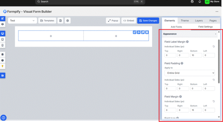
- Field Label Margin
Set spacing around the field label. - Field Padding
Control the inner spacing of the Grid.
Set padding for each side individually (Top, Right, Bottom, Left). - Field Margin
Control the outer spacing of the Grid.
Adjust each side separately (Top, Right, Bottom, Left) in pixels. - Field Icon
Select Icon: Choose an icon to display inside the field (e.g., Email).
Icon Position: Set the icon placement (Left or Right).
Icon Color: Choose the icon color.
- Field Border Radius: Set the corner roundness of the field (in px).
- Custom CSS Class: Enter a custom CSS class name to apply additional styling.
3.3 Advanced Section
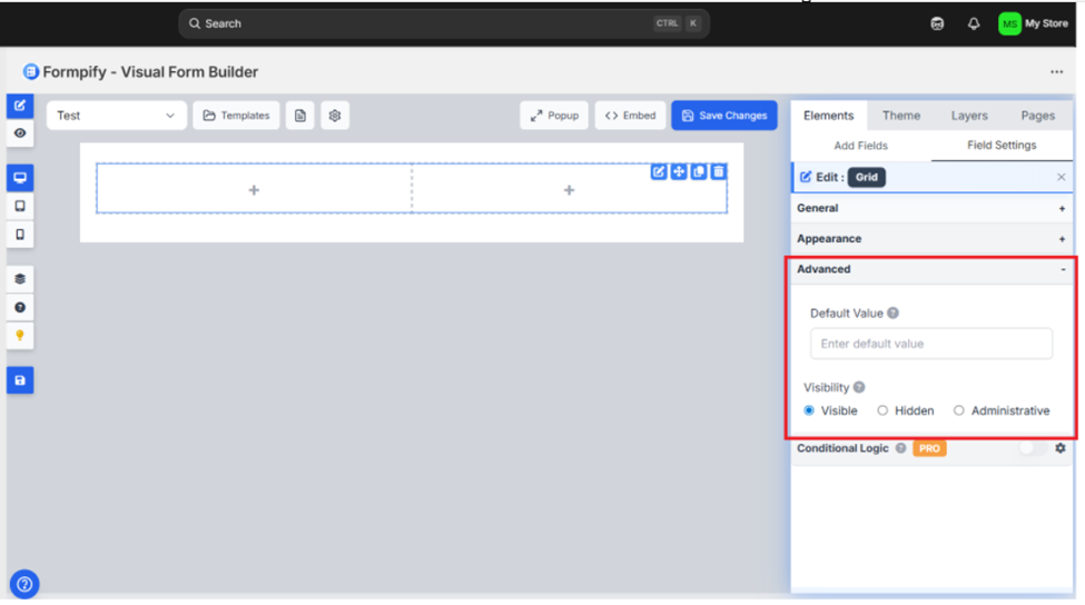
- Default Value: Enter a predefined value that will appear in the field by default.
- Visibility
- Visible: The field is displayed to all users.
- Hidden: The field is not shown on the form.
- Administrative: The field is visible only to administrators.
4. Edit Each Grid Column:
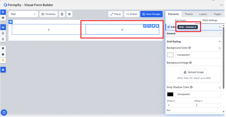
Hover over the specific Grid column (left or right).
Click the Edit (pencil) icon on that column.
The settings panel will open for Grid – Column 1 or Grid – Column 2, you can configure:
- Background Color: Supports solid color or transparent (default)
- Background Image: Upload an image (JPEG, PNG, GIF, WebP up to 5MB).
- Size:
- Cover: Scales the background image to completely cover the container. The image keeps its aspect ratio but may be cropped if necessary.
- Contain: Scales the image so the entire image fits inside the container. The image is fully visible but may leave empty space.
- Auto: Displays the image at its original size. The container does not scale the image automatically.
- Stretch: Stretches the image to fill the container both horizontally and vertically. The image does not preserve its original aspect ratio.
- Position:
- Center: Centers the image both horizontally and vertically inside the container
- Top:Aligns the image to the top center of the container.
- Bottom: Aligns the image to the bottom center of the container.
- Left: Aligns the image to the left center of the container.
- Right: Aligns the image to the right center of the container.
- Top Left: Anchors the image to the top-left corner of the container.
- Top Right: Anchors the image to the top-right corner of the container.
- Bottom Left: Anchors the image to the bottom-left corner of the container.
- Bottom Right: Anchors the image to the bottom-right corner of the container.
- Center Top: Centers the image horizontally and aligns it to the top.
- Center Bottom: Centers the image horizontally and aligns it to the bottom.
- Center Left: Centers the image vertically and aligns it to the left.
- Center Right: Centers the image vertically and aligns it to the right.
- 25% 25%: Positions the image 25% from the left and 25% from the top.
- 50% 50%: Positions the image exactly at the center.
- 75% 75%: Positions the image 75% from the left and 75% from the top.
- 100% 100%: Positions the image at the bottom-right corner.
- Drop Shadow Color
- Defines the color of the shadow applied behind the element.
- Shadow Offset
- Offset X: Controls the horizontal position of the shadow.
- Offset Y: Controls the vertical position of the shadow.
- Blur
- Controls shadow blur strength.
- Border Radius
- Top Left: Controls the radius of the top-left corner.
- Top Right: Controls the radius of the top-right corner.
- Bottom Right: Controls the radius of the bottom-right corner.
- Bottom Left: Controls the radius of the bottom-left corner.
All styling changes apply only to the selected column, not the entire grid.
5. Reorder the Grid Field
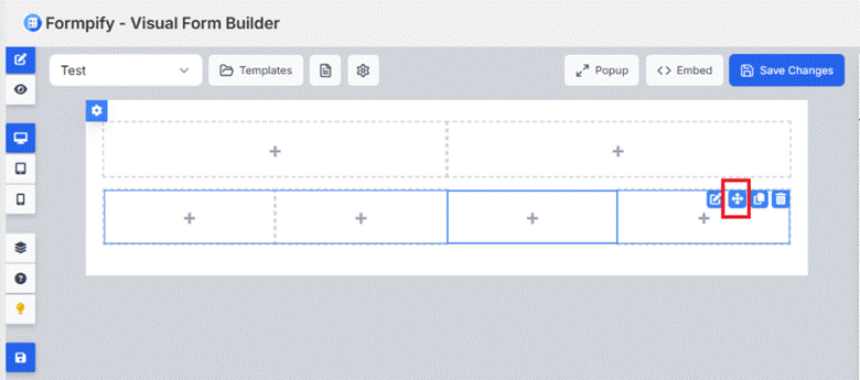
- Hover your mouse over the entire Grid block in the preview (not individual columns, but the entire Grid).
- When the Grid is highlighted, find the drag/drop icon (Move or the four-way arrow icon) in the corner of the Grid.
- Click and hold the mouse on the drag icon.
- Hold the mouse and drag the Grid up or down in the form layout.
- The system will display the drop position (placeholder) so you know where the Grid will be placed.

- Release the mouse at the desired position.
6. Multiple Level Grid
- Add a Grid field to the form. This creates Level 1.

- Drag another Grid field from the field panel.
- Drop the new Grid directly inside the existing Grid.
The newly dropped Grid becomes nested inside the first Grid, creating Level 2.
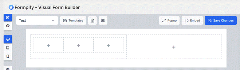
- To create more levels, repeat the same action:
- Drag another Grid field.
- Drop it inside a nested Grid.
Each time a Grid is dropped inside another Grid, a new level is created (Level 3, Level 4, etc.).
7. Edit Form Wrapper Design
- Click "Edit Form Wrapper Design" above the preview area.
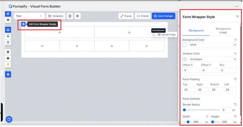
- Adjust layout, background, borders, spacing, and styling of the form container.
8. Duplicate the Grid Field
- Hover over the Grid field container.
- Click the Duplicate icon.
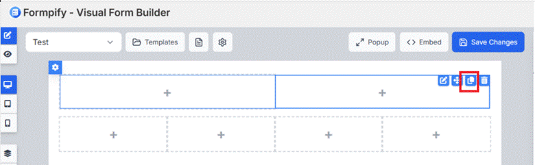
- A new Grid field with the same column structure and styling will be created.
9. Delete the Grid Field
- Hover over the Grid field container.
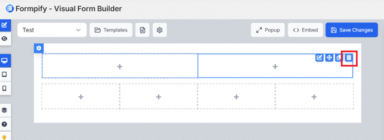
- Click the Trash icon to remove it from the form.
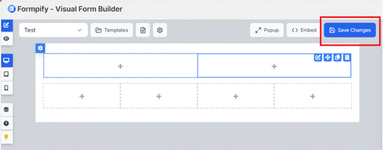
10. Save Changes
- Click Save Changes in the top-right corner to apply all updates.