
How to Use the Input Table Field
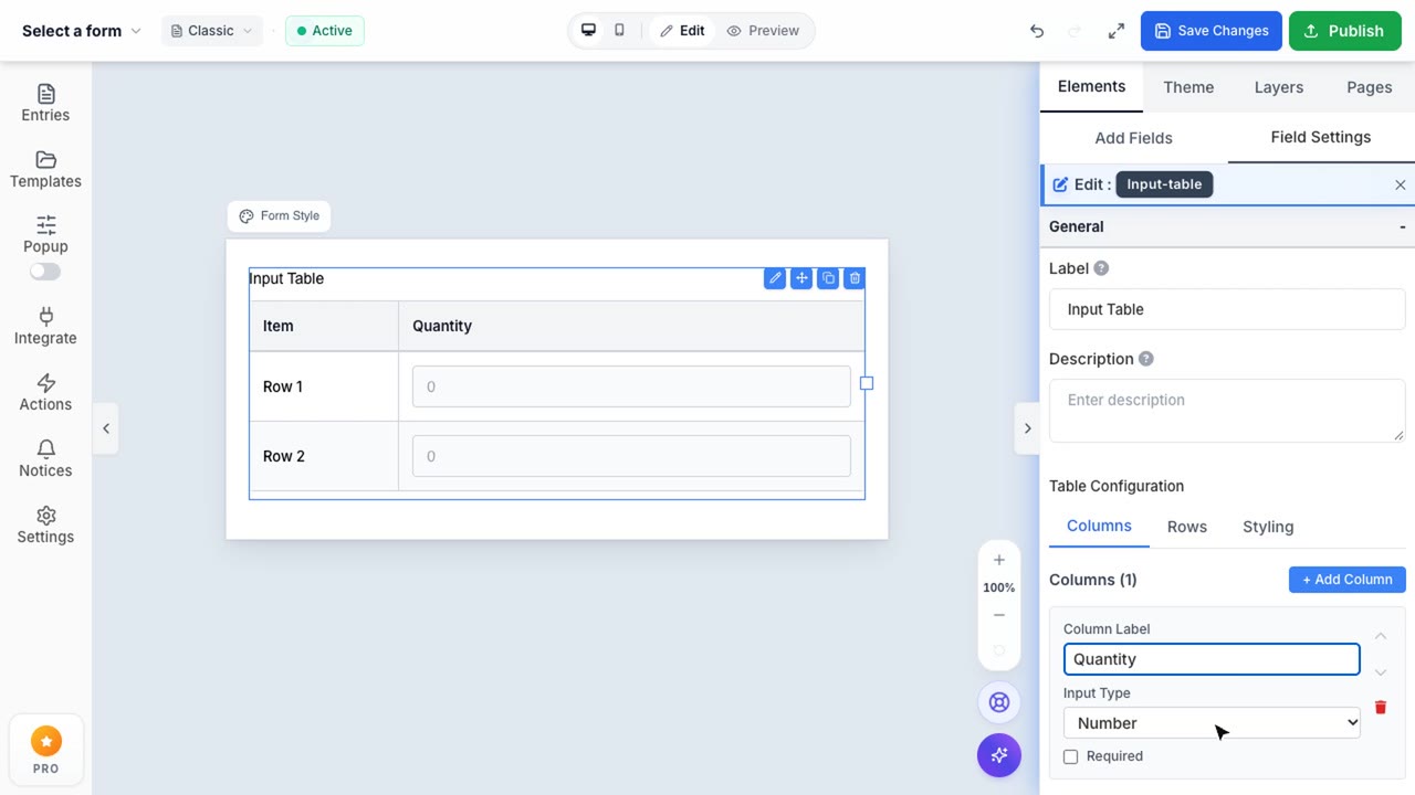
Input Table Field Configuration
A powerful matrix field to collect structured grid data across customizable rows and columns.
1. Drag and Drop the Input Table
To begin collecting structured grid data, drag the Input Table field from the Elements sidebar onto your canvas. This powerful matrix allows users to input multiple data points efficiently across rows and columns.
2. Configure Columns
In the Right Sidebar, you will see the Table Configuration panel. By default, it opens on the Columns tab. Here you can add new columns and specify the data type for each column. Available input types include Text, Number, Dropdown, Radio, Checkbox, Date, and Time. For example, you can create a "Size" column and set its type to Dropdown, then define the available options right below it.
3. Manage Rows
Switch to the Rows tab to manage the items listed on the left side of your table. You can manually add, edit, or remove rows. Alternatively, you can enable the Dynamic Rows toggle. When enabled, your end-users will see an "Add Item" button, allowing them to dynamically add as many rows as they need while filling out the form. You can also enforce a minimum and maximum row limit.
4. Customize Table Styling
Finally, navigate to the Styling tab. This section allows you to adjust the visual appearance of your Input Table. You can:
- Toggle Striped Rows & Borders: For better readability.
- Adjust Density: Choose between Compact, Comfortable, or Spacious padding depending on how much data needs to fit on the screen.
- Customize Header Colors: Change the background and text color of the table headers to perfectly match your brand's aesthetic.