
How to Use the Popup Feature
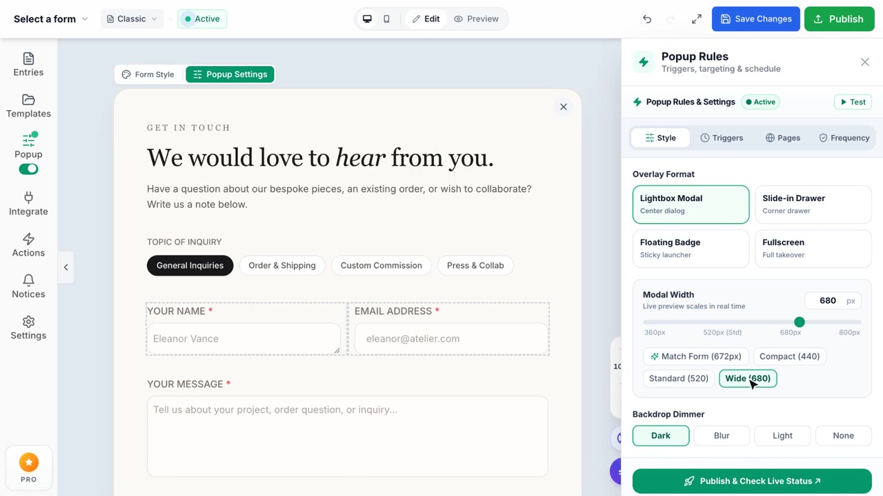
Popup Forms
Turn any form into a powerful popup overlay.
Formpify allows you to instantly convert any form into a beautiful popup overlay without writing any code. The Popup Feature provides multiple layouts, smart triggers, deep session control, and custom styling options, allowing you to capture leads effectively while keeping your visitors engaged.
Step 1. Enable Popup Mode
Open the Form Settings from the builder interface and navigate to the Popup & Overlay tab. Toggle the feature on to instantly preview your form inside a floating modal window directly within the builder canvas.
Step 2. Choose Layout & Positioning
Select from multiple beautiful container layouts and positional overrides to match your store's structure:
- Container Types: Standard Centered Modal, Edge Slide-in, Bottom Bar, or Full Page takeover.
- Size Rules: Choose from Small (400x300), Medium (500x400), Large (600x500), or completely Custom dimensions.
- Position Overrides: Force the popup to dock to specific corners (Top Right, Bottom Left, etc.) or set custom X/Y coordinates on the screen.
Step 3. Configure Smart Triggers
Decide exactly when your popup should appear to maximize conversion. Formpify offers several trigger modes:
- Auto-trigger on Page Load: Shows instantly when the page finishes loading.
- Time Delay: Display the popup automatically after waiting for a specific duration (e.g., 5 seconds).
- Scroll Percentage: Triggers specifically when the user scrolls down to a certain percentage of your Shopify page (e.g., 50%).
- Exit Intent: Intelligent trigger that fires exactly when the visitor's mouse leaves the browser viewport, attempting to recover abandoning visitors.
- Manual Trigger: Easily attach the popup to any existing link or button on your store. Simply add the class
formpify-triggerto your anchor tags or buttons (e.g.<button class="formpify-trigger">Subscribe</button>). - Element Click: Provide a CSS Selector (e.g.,
#my-custom-btn) to tie the popup sequence to specific elements in your theme.
Step 4. Session Control & Display Frequency
Protect your user experience by controlling how often the popup appears across user sessions:
- Use Session Storage: Toggle this on to prevent the popup from displaying repeatedly if the user closes it during their active browsing session.
- Show on Every Page Load: Force the popup to show on every page visit, ignoring the standard session cooldown.
- Custom Session Key: Setup distinct session memory identifiers. Useful if you run multiple different campaigns on the same Shopify store and want to track their display rules independently.
Step 5. Overlay Styling & Animation
Finalize the aesthetics of the popup wrapper:
- Backdrop Styles: Dark Overlay, Light Overlay, frosted Blur Background, or completely transparent (No Backdrop).
- Entry Animations: Smoothly transition the popup into the viewport using Fade, Slide, Zoom, or Bounce animations.
- Close Button Mechanics: Reposition the exit button natively to any corner, and customize the close text/symbol (e.g., "X", "Close", or "Nhấp để thoát").
- Remove Wrapper Styling: Enable "Use Original Form Styling" to strip the modal's default canvas borders and background, rendering your raw form fields cleanly over the backdrop.